

Kills & Thrills
Illustration ★ Environmental Design

Develop a logo, visual identity, and environmental graphic design assets for a horror themed amusement park for the 18+ market obsessed with scary movies and thrilling rides.
Objective

First, who are we selling to? Let’s explore three personas to define our audience.
Research

I’m a mother and elementary school teacher that uses horror as a form of escapism. As an educator I don’t like seeing children in horror spaces that are developmentally inappropriate for them.
Sheri Tillman Age 42
Ben Cho Age 28

I’m a child-free adult that runs a true crime podcast. I love my job but when I’m not working I like to enjoy horror not based in reality.
I’m a non traditional film student that’s infatuated with the way horror is made, especially SFX. I want to make my own horror films one day.
Alice Zimmerman Age 30

Now that we know our audience let’s gather the rest of the building blocks for our brand.
S.W.O.T. Analysis
Strengths - Fully committed to the horror genre, non-judgemental environment Weaknesses - Niche, counter-culture in a red state Opportunities - More and more ventures, such as the streaming service Shudder, are finding success in the horror market Threats - Haunted houses, the waterpark portion is seasonal
Onliness Statement
We are the only year-round, Texas based, horror theme park that caters to the 18+ market.
Brand Voice
Spooky and Fun
Who We Are
We are passionate about horror and childfree.
Who We Are Not
We are not inauthentic or inaccessible.

The Shiny Stuff
^ Primary Mark
^ Secondary Mark
^ Tertiary Mark

The primary color palette used for Kills & Thrills is inspired by this still from the 2007 adaptation of Stephen King’s IT
⌄ Color Palette
dried blood left for red for georgie pumpkin head hair of carrie ghost shark rosemary’s baby blue from the deep the hedge maze
⌄ Typefaces


Monserrat Medium
Overpass Black
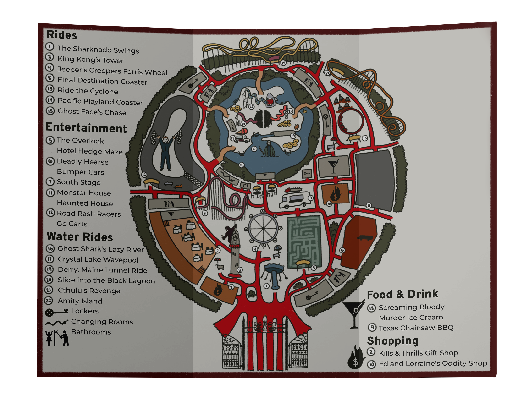
Every aspect of Kills & Thrills was designed with the horror genre in mind. The icons on the map are all referencial, The key to the lockers being the key from Coraline and the bathroom sign being inspired by the bathroom scene from the shining. The attractions and buildings are also full of references, for example, Ed & Lorraine’s Gift Shop referring to Ed and Lorraine Warren, the famous exorcists. The sign on the side of the shop features the real life and movie adaptation of the famous doll Annabelle.

Overpass features angled ascenders mimicking the aggression of the knives featured in the marks for Kills & Thrills. Monserrat compliments Overpass, particularly seen in its sharp apexes and vertices.


⌄ Standees


⌄ Stickers
